Your cover page is the cherry on top of your product cake – it is the first thing your buyers will see when browsing through your store or in the search results. Creating an eye catching product cover page is super important so that your product stands out from the crowd and gets noticed by buyers. This little how to will give you some easy tips on how to create a beautiful cover page for your Teachers Pay Teachers product.
*You may copy any of the layouts on this page in your own cover designs!*

Bold titles
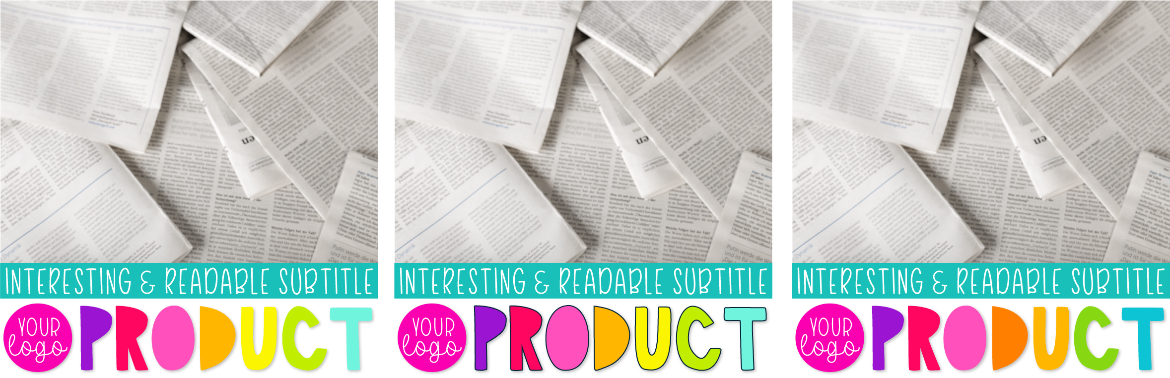
A bold title is essential and needs to be easily readable on your product thumbnail (i.e. before a buyer hovers over the image and it enlarges). Your title should be an easy to read font – sans fonts or large chunky fonts will always work best. If you want to use a pretty script font then use this sparingly and as an accent rather than the main text. Bonus tip: When using rainbow lettering, avoid light, lemon yellow as these do not show up clearly (unless on black) Rather use an orange yellow.
Limit additional text
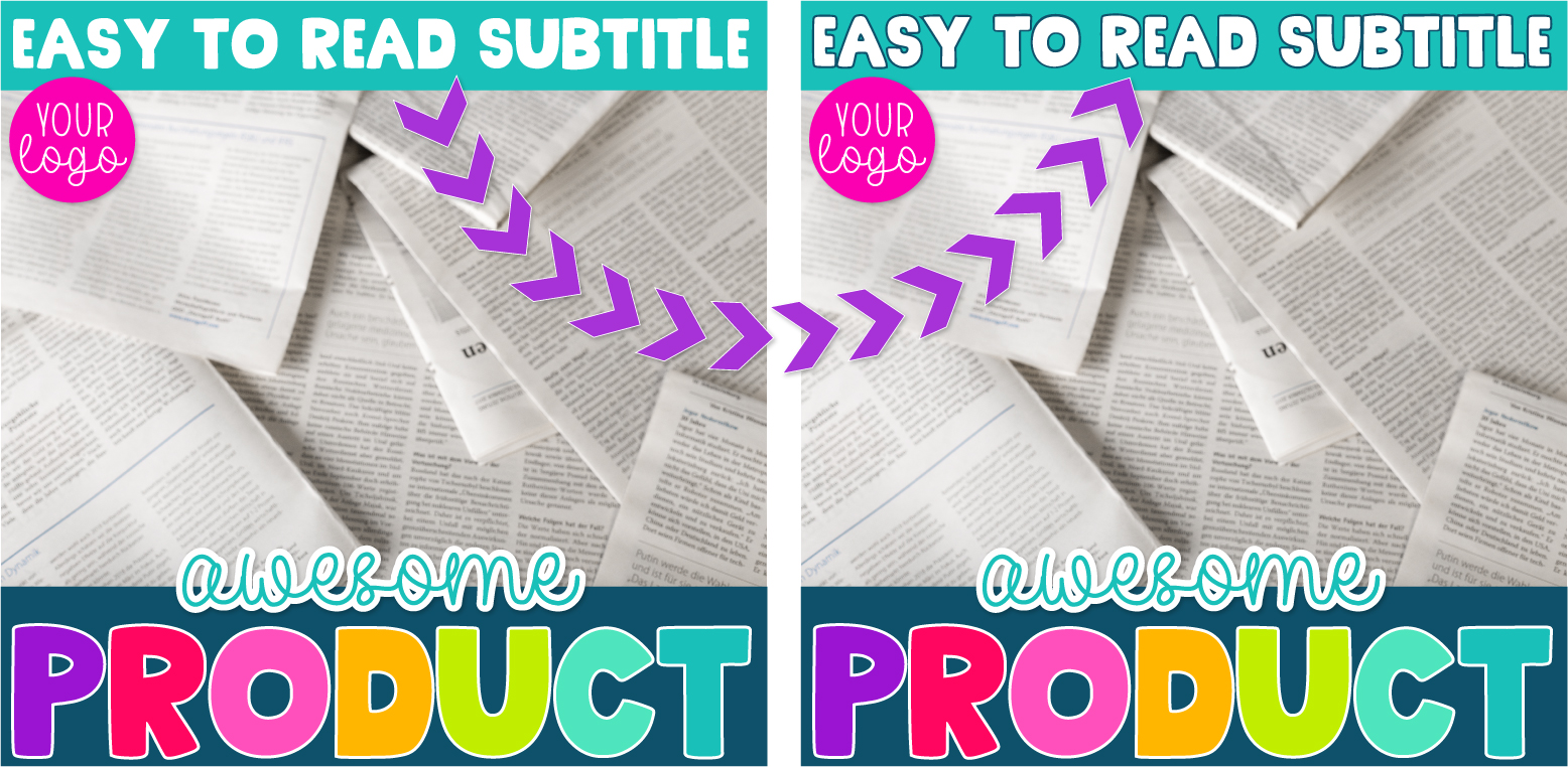
To avoid your cover looking too busy, limit any additional text. Confine sub titles to a short sub title below the main title or at the bottom of the page. A thin band of color behind your caption is always effective – just make sure the text on top is bolder and easily readable on top of the color. Bonus tip: if you find any additional text isn’t popping enough, adding a a darker outline can help it stand out more.
Include product images
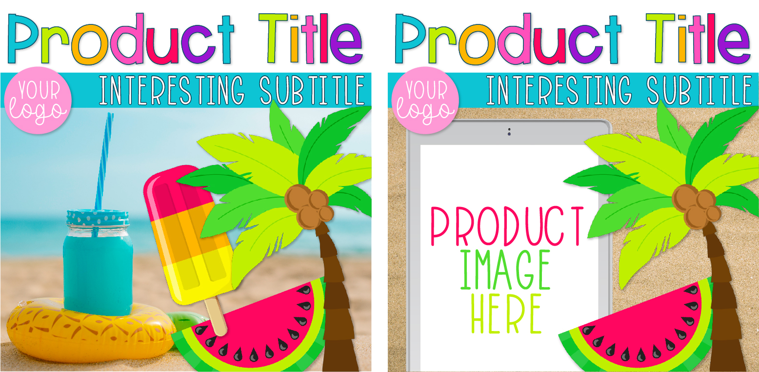
Including a product image or two is a great way to show potential buyers what is included in your product. However, avoid adding too many pages as this could look cluttered and, also, the smaller the page, the less buyers can see of it. One or two larger product images or an image of your product in action will always work better. Bonus tip: Use a png ipad image to show an enlarged part of your product.
Clip Art & Photos
On your cover page, you want your product to be the main focus. To add interest, you could place your product images on top of a photo that relates to your product. Adding a clip art image above these adds further interest. Place your clip art image in a unique way – extend it off the page so it looks like it is popping in or layer it between your product images. Only add the clip art if it enhances your cover design and doesn’t make it look too busy. You don’t want your buyers to think you are selling clip art either so be sure to use it sparingly and thoughtfully! Bonus tip: Add a shadow to the clip art to really make it look like it is popping.